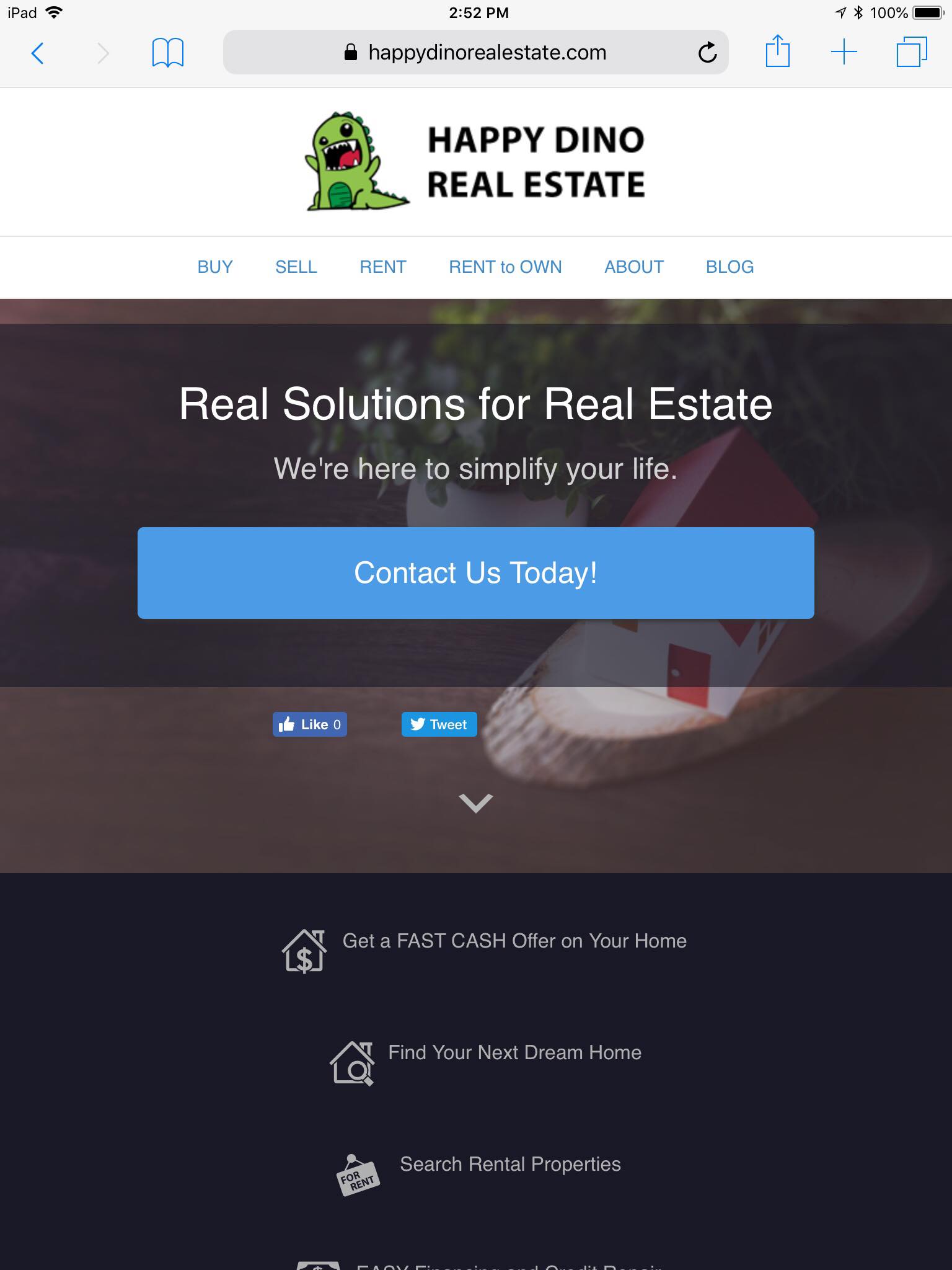
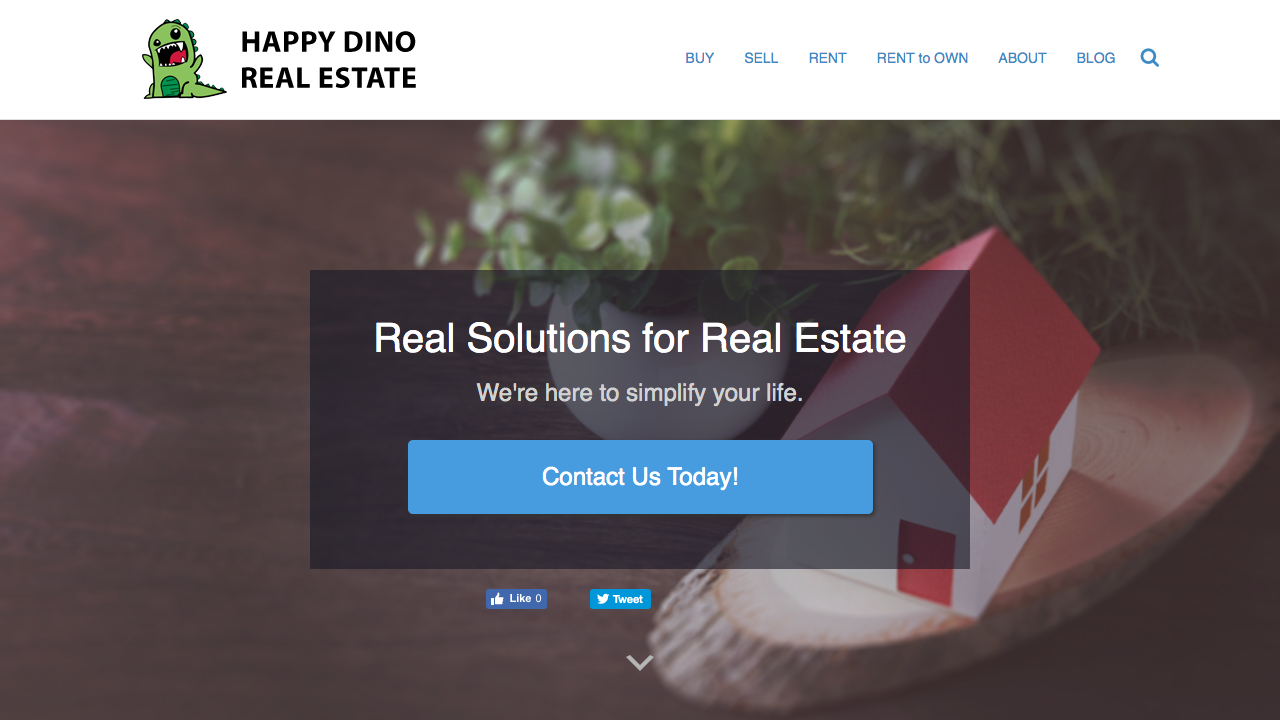
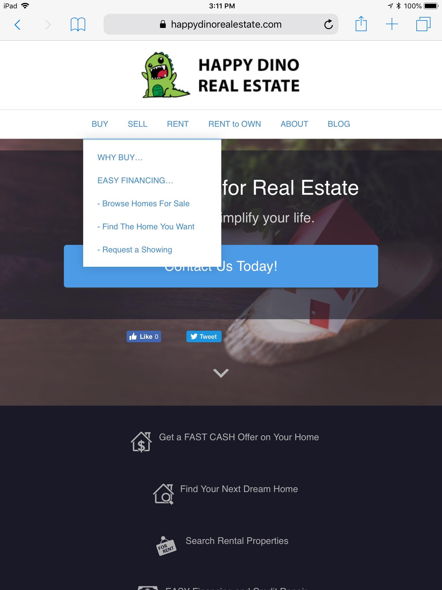
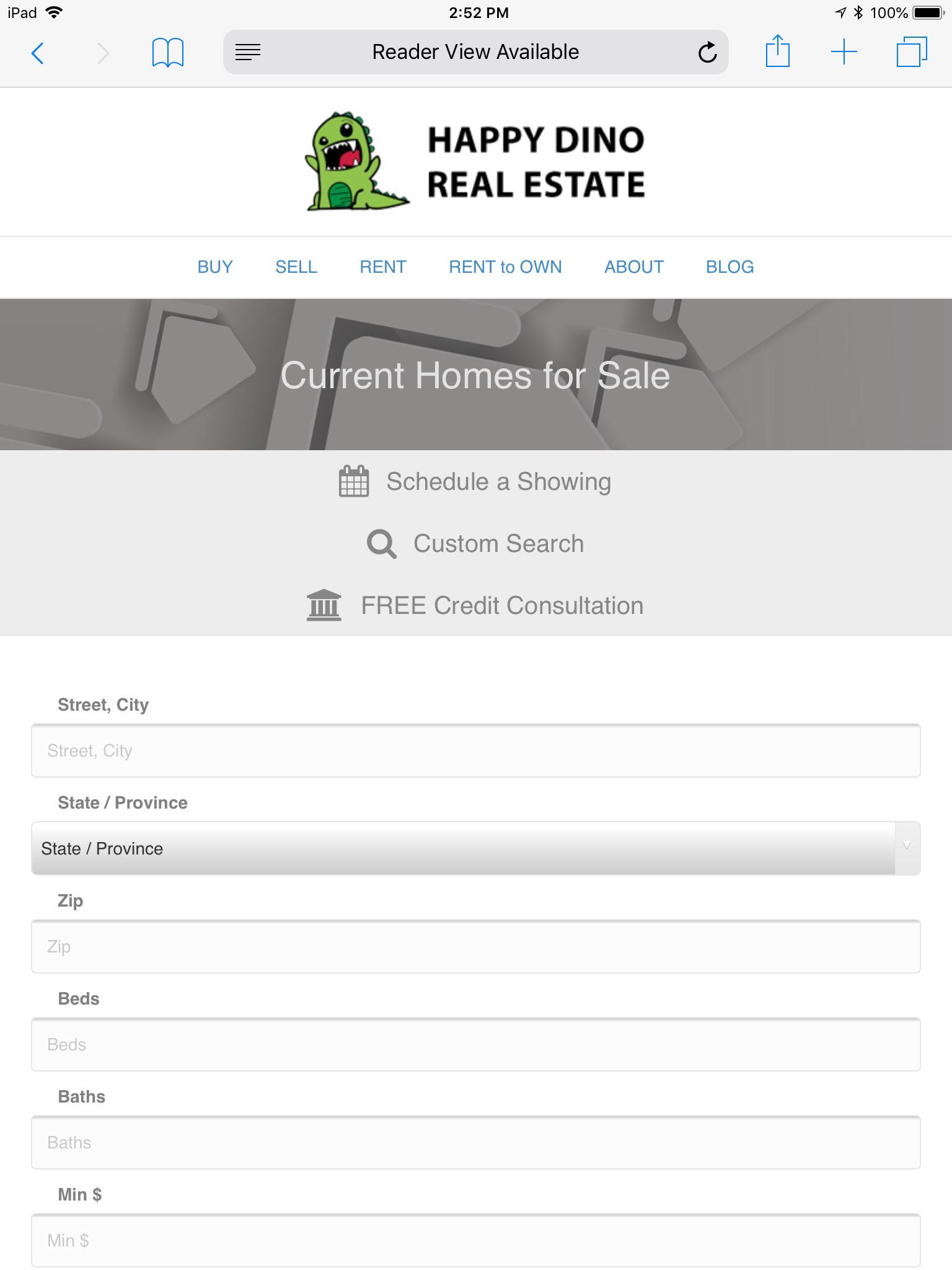
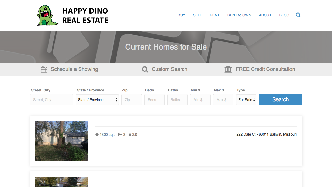
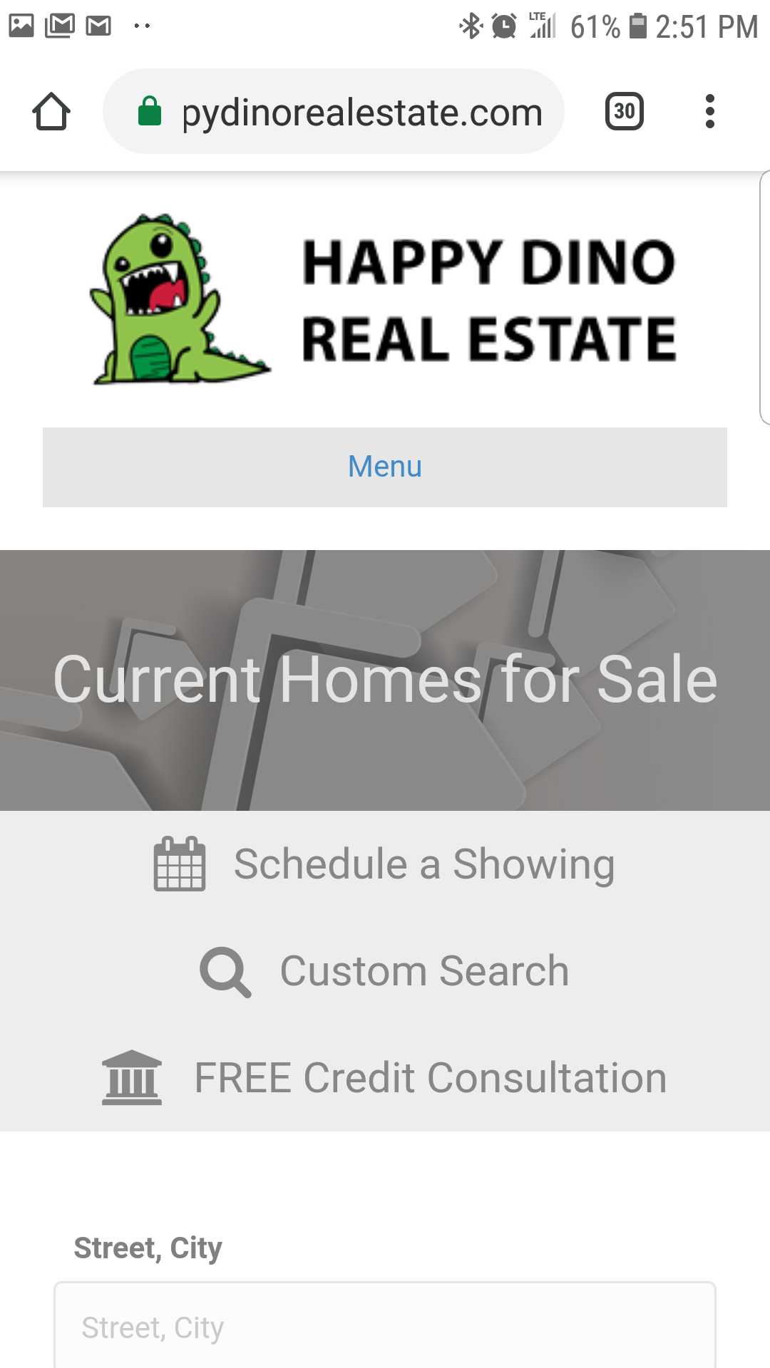
All REI BlackBook websites and landing pages are mobile responsive. That means they are fully functional and look great on phones and tablets just as they would on laptops and desktops. To insure that your website is most easily viewed on the medium it is on, we ensure that all elements of the site respond to the layout of the device. As an example, below is the same website viewed on three different devices.
Authority Website Home Page
| Laptop | Tablet | Phone |
|
|
 |
|

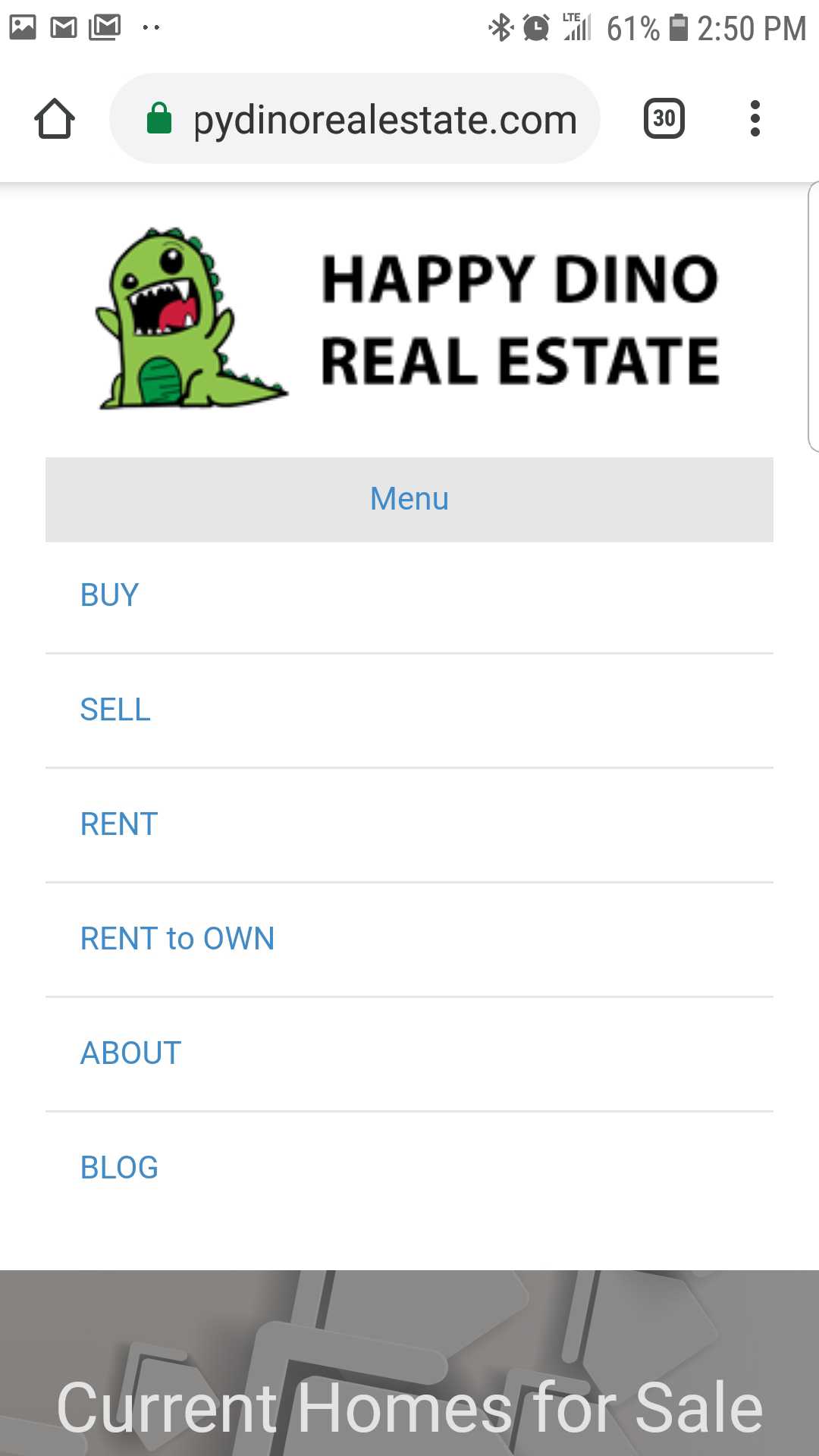
Menu Structure
| Laptop | Tablet | Phone |
|
Laptop
|
|
|

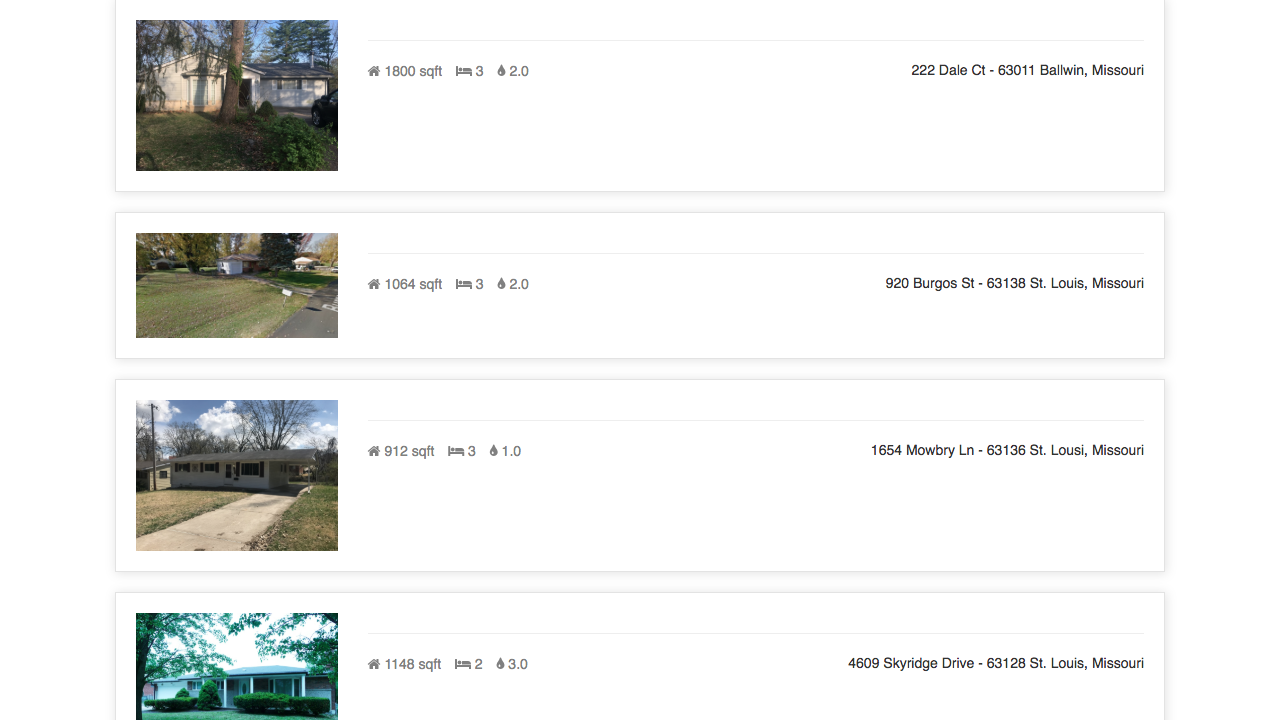
Pages
| Laptop | Tablet | Phone |
|
|
 |
|
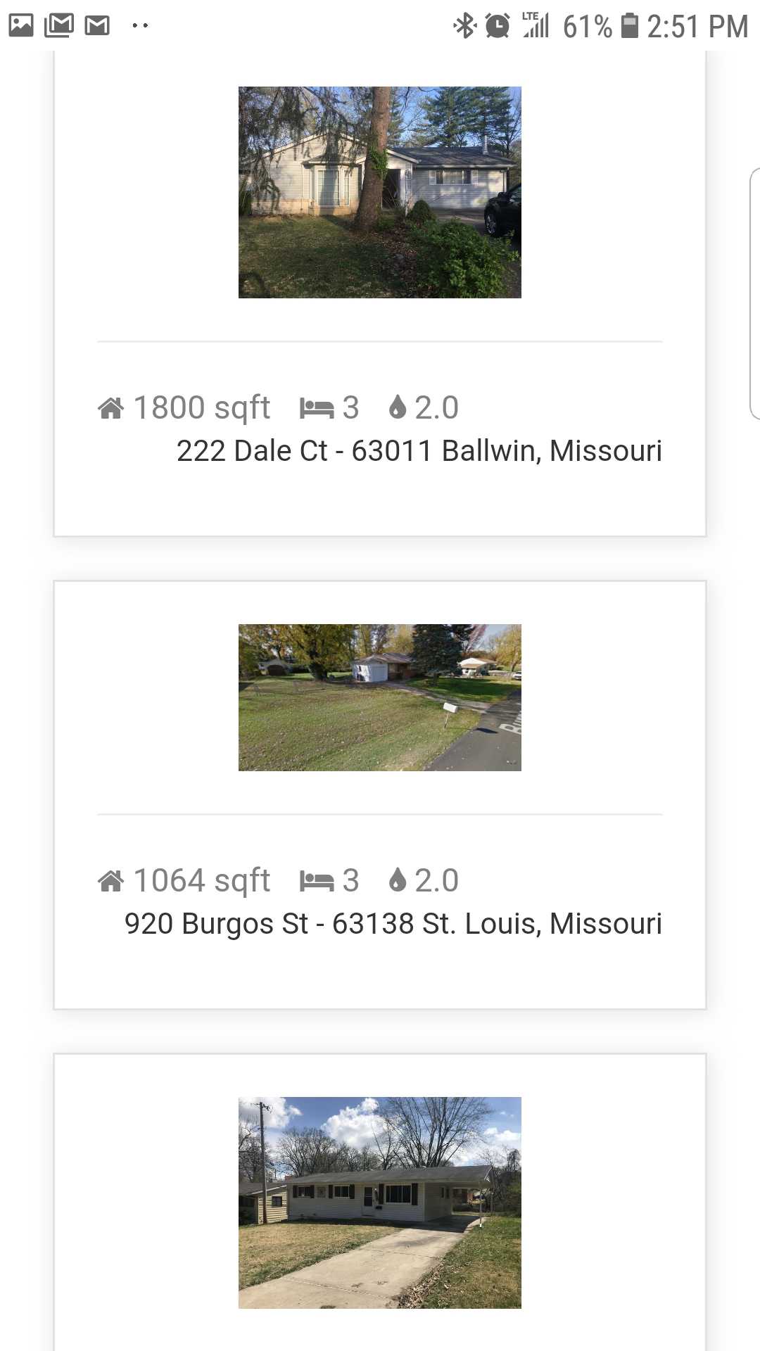
Listings
| Laptop | Tablet | Phone |
|
|
 |
|
If you have any questions about mobile responsiveness or anything else please feel free to contact us at support@reiblackbook.com